Product Design | Mobile App

Product Design | Mobile App

Accelerated time to market with a UI kit–driven redesign that cut design time by 70%

Accelerated time to market with a UI kit–driven redesign that cut design time by 70%

Problem

Problem

The white-label app had an outdated UI and inconsistent usability, making delivery slow, increasing redesign effort, and limiting Mobilise’s ability to scale efficiently across clients.

Goal

Goal

I aimed to modernise the interface, improve usability, and create a scalable foundation, through a reusable UI kit, that would enable the team to support multiple clients faster and with far less redesign work.

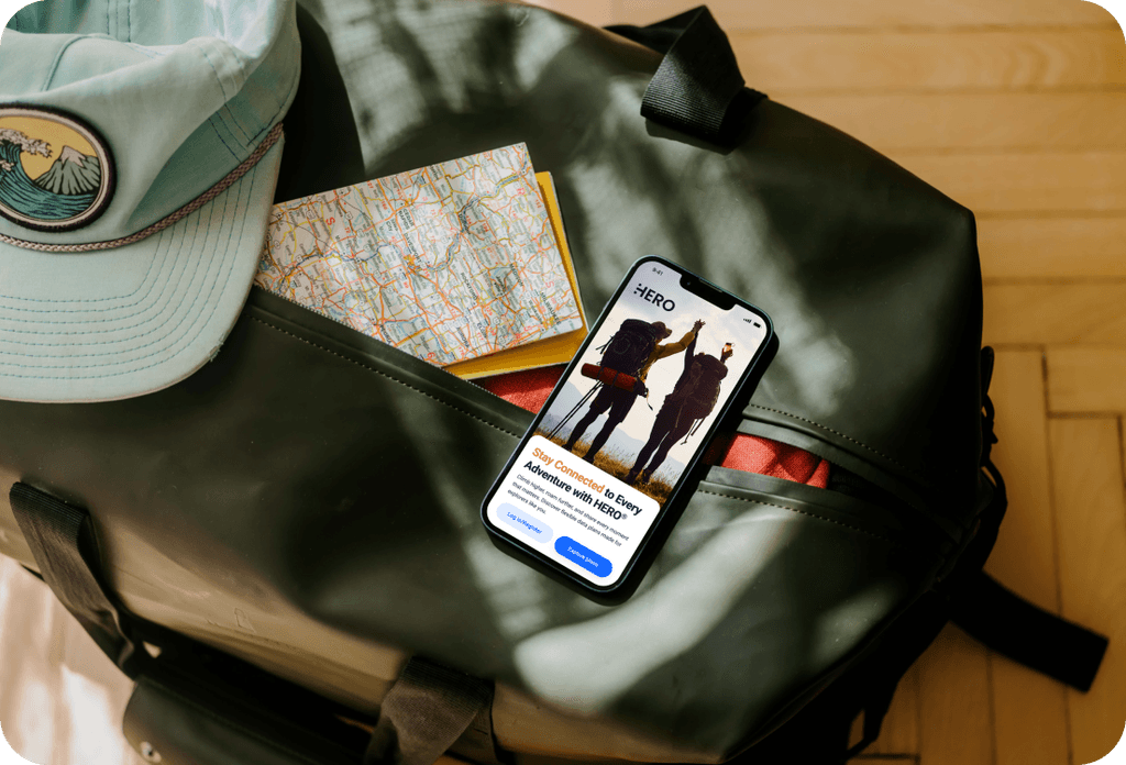
Mobile phone displaying HERO travel app home screen inside an open backpack with travel items.
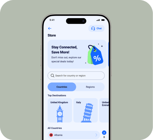
HERO app Store screen showing top destinations and list of available countries.
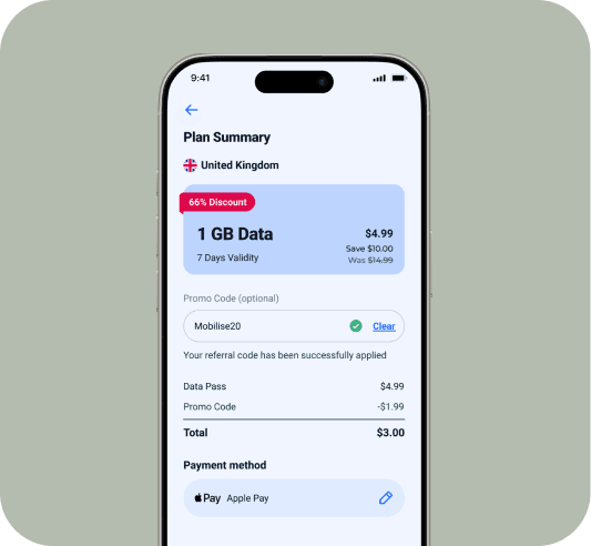
HERO app plan summary screen showing data plan details and payment method.

Workflow

Workflow

I partnered closely with product, QA, and dev teams to audit existing flows and identify inconsistencies affecting usability and delivery time.
My responsibilities included:

  • leading the UX and UI direction

  • designing the reusable UI kit (components, patterns, spacing, typography, interactions)

  • standardising layouts across key screens

  • prototyping updated flows for validation

  • ensuring the kit could flex to each client’s branding

As a team, we:

  • validated components through QA and internal testing

  • aligned on technical feasibility

  • refined edge cases

  • implemented the UI kit into the full product

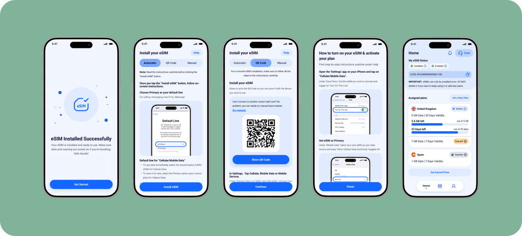
HERO app eSIM installation walkthrough showing success, instructions, QR, and activation screens.

Challenge

Challenge

Balancing the need for client-specific branding with the efficiency and consistency of a core design system.
I solved this by creating flexible patterns, scalable components, and brand-agnostic foundations that could adapt to different visual identities without redesigning layouts from scratch.

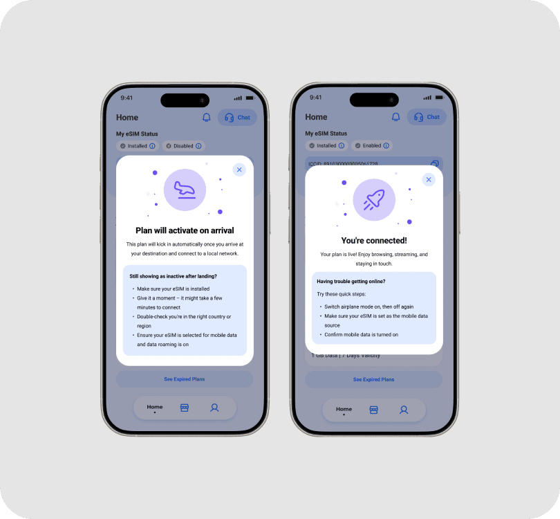
HERO app success screens showing plan activation steps and connection confirmation.
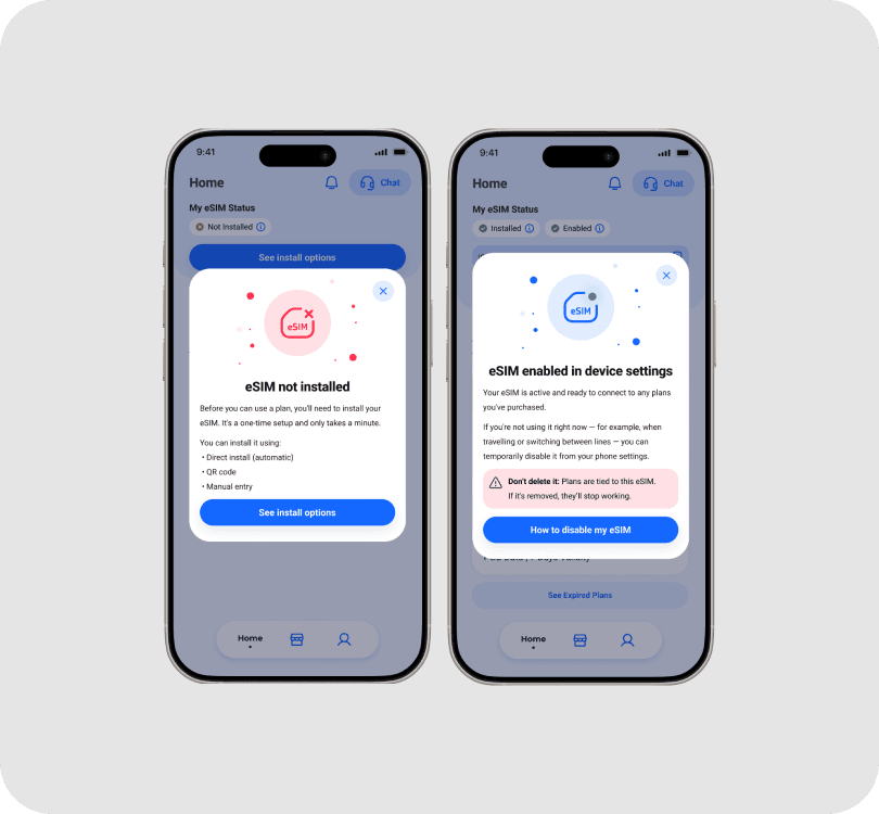
HERO app error and guidance screens for eSIM installation and device settings.

Results

Results

What I delivered:

  • A modernised interface with clearer flows and improved usability

  • A complete reusable UI kit that standardised the entire product

  • Scalable patterns that reduced design debt and future redesign work

What we achieved as a team:

  • Reduced design time for a basic client app by ~70%

  • Faster, cleaner handover to developers

  • Reduced QA friction thanks to consistent components

  • A more intuitive experience for end users, with clearer plan details and simpler navigation

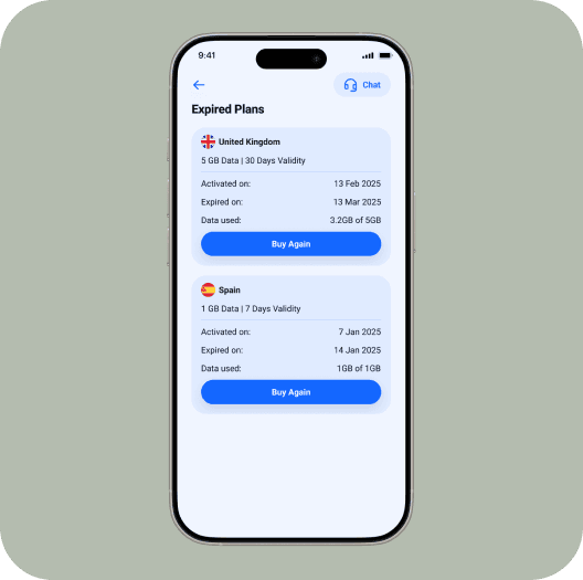
HERO app screen showing expired mobile plans and renewal options.
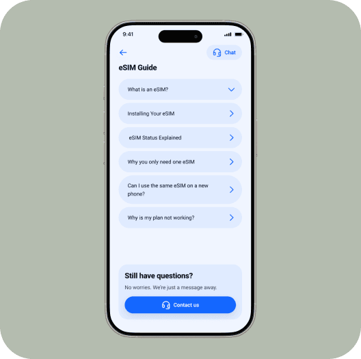
HERO app eSIM guide with step-by-step support topics.
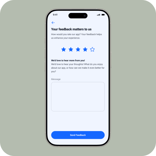
HERO app feedback form with star rating and text field.

Impact

Impact

The new UI kit became the foundation for dozens of client projects, making Mobilise’s white-label app faster to deliver, easier to customise, and more attractive in sales conversations.
It significantly strengthened scalability and positioned Mobilise as a more competitive provider for B2B2C clients.
Selected Works

Madalina Burciu

Product & Marketing Design Lead

Madalina Burciu

Product & Marketing Design Lead

Madalina Burciu

Product & Marketing Design Lead