Product Design | Website

Product Design | Website

Boosted clarity, conversion, and lead quality with a redesigned Mobilise website

Boosted clarity, conversion, and lead quality with a redesigned Mobilise website

Problem

Problem

The old website no longer reflected Mobilise’s evolved brand or expanded product suite. It was content-heavy and unclear, with analytics showing high drop-off before users reached key sections and low engagement on product pages.

Goal

Goal

I aimed to align the website with the refreshed brand, improve usability and engagement, and communicate Mobilise’s offering more clearly through a cleaner, more modern, data-informed experience.

Desktop monitor showing the redesigned Mobilise homepage with a plant in the foreground.

Workflow

Workflow

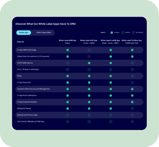
I partnered with marketing, leadership, and developers to restructure content and simplify navigation using insights from Google Analytics, Hotjar, and Microsoft Clarity.

My responsibilities included:

  • leading the UX and UI direction for the redesign

  • conducting analytics reviews to identify friction points and drop-offs

  • restructuring site architecture and navigation

  • redesigning page layouts with stronger hierarchy and improved readability

  • applying purposeful spacing and clearer content groupings

  • ensuring the updated brand visuals were translated consistently across pages

As a team, we:

  • refined messaging and positioning

  • validated layout decisions with behavioural data

  • iterated on components and templates based on stakeholder feedback

  • aligned technical implementation with dev for a smooth launch

Comparison screen showing who the White-Label eSIM app is for, highlighting telecom and non-telecom provider use cases with example mobile UI previews.
“Feature comparison table showing the capabilities of different white-label telecom apps. Columns compare White-Label eSIM App, VoIP App, V+eSIM App, and Try/Buy App across features like in-app eSIM, global connectivity, VoIP/SMS, verification, shop, payments, account management, notifications, support, billing, promo codes, and website access. Checkmarks indicate included features, circles show optional items, and crosses mark not included.

Challenge

Challenge

Balancing storytelling and brand expression with UX performance. The design needed to feel vibrant and recognisable while improving accessibility, scannability, and engagement across devices — without overwhelming users with content.

Person holding a tablet displaying the updated Mobilise contact page.
Before comparison of Mobilise’s about page redesign.
After comparison of Mobilise’s about page redesign.
Before comparison of Mobilise’s MVNO Services page redesign.
After comparison of Mobilise’s MVNO Services page redesign.

Results

Results

What I delivered:

  • A redesigned structure with simplified pathways and clearer hierarchy

  • Smarter layouts that improved readability and content discovery

  • A more modern, trustworthy visual experience aligned with the evolved brand

What we achieved as a team:

  • 44.8% increase in user engagement after launch

  • 140% increase in scroll depth, showing users explored more content

  • A more intuitive experience that improved product understanding and supported better inbound conversations

Website contact form with modern gradient background.
Client testimonial card.
Client testimonial card with Mobilise metrics and social proof.

Impact

Impact

The redesign strengthened both UX and brand perception, creating a consistent, scalable foundation for Mobilise’s continued growth. It improved how prospects understood Mobilise’s offering and positioned the company as a more mature, credible, and modern telecom technology partner.

Selected Works

Madalina Burciu

Product & Marketing Design Lead

Madalina Burciu

Product & Marketing Design Lead

Madalina Burciu

Product & Marketing Design Lead